Understanding Line Art Basics: Start Seeing in Lines

Chosen theme: Understanding Line Art Basics. Welcome to a gentle, inspiring gateway into drawing with clarity. Together we’ll explore how simple lines can express shape, light, and emotion—no heavy shading required. Subscribe, sketch along, and share your progress to grow your confidence stroke by stroke.

What Line Art Really Means

Line art is more than outlining objects; it’s the language of edges, overlaps, turns, and tension. By focusing on lines alone, you train your eye to notice structure, proportion, and direction, building a foundation that strengthens every drawing you make.

What Line Art Really Means

When you remove shading and color, the skeleton of the subject appears. Lines force decisive choices: which edge matters, which gesture leads the eye, which detail can be implied. This simplification cultivates clarity, helping your drawings feel intentional, readable, and alive.

What Line Art Really Means

I once drew a friend’s profile with five quick lines on a café napkin. The likeness worked because each stroke captured a crucial angle—the brow ridge, nose bridge, lip curve, and chin. Fewer lines meant stronger decisions, and stronger decisions meant recognition.

Tools and Surfaces for Confident Lines

Pens, pencils, and brushes compared

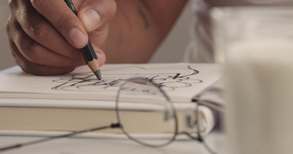
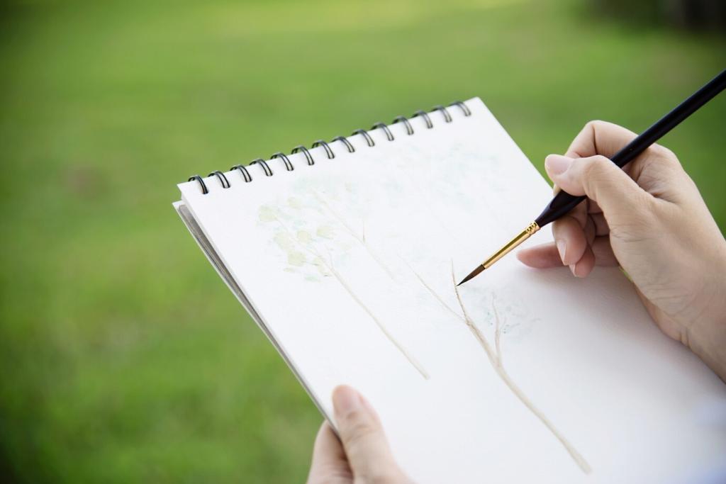
Fineliners give consistent width, great for tidy contours. Graphite pencils vary with pressure, perfect for whisper-light construction. Brush pens offer expressive tapers and bold accents. Try several and notice how each tool changes your line energy, speed, and willingness to commit.

Line Quality: Weight, Flow, and Rhythm

Primary contours describe the edges we see; cross-contours wrap around forms, hinting at volume without shading. A few well-placed cross-contour strokes can turn a flat silhouette into a convincing object, guiding the viewer’s eye around curves, planes, and directional changes.

Light and Form Without Shading

Clustered lines feel darker; sparse lines feel lighter. Group strokes where planes turn away from light, and open spaces where forms face illumination. This density shift mimics value, guiding perception of depth without crosshatching or solid fills.

Light and Form Without Shading

In bright areas, let lines fade or break to suggest glare or soft edges. In shadow zones, reinforce edges with weight. Alternating lost and found edges creates sparkle and realism, while keeping your drawing elegant and uncluttered.

Light and Form Without Shading

Show wood grain with a few directional ticks, fabric with gentle dashed curves, and hair with flowing, grouped strands. Choose signature marks that describe a surface in minimal strokes. The fewer lines you use, the more each one must carry meaning.

Light and Form Without Shading

Lorem ipsum dolor sit amet, consectetur adipiscing elit. Ut elit tellus, luctus nec ullamcorper mattis, pulvinar dapibus leo.

Composing with Lines

Guide attention by concentrating detail and darker lines where you want viewers to linger. Keep secondary areas lighter and simpler. A clear focal point, supported by subordinate shapes and quieter marks, helps the drawing read instantly and feel intentional.

Composing with Lines

A strong gesture line unites the pose or scene. Think of it as the main current in a river, pulling other lines along. Use repeating curves, arrows, or converging angles to steer the eye smoothly from entry to destination.
Growingatgrove
Privacy Overview

This website uses cookies so that we can provide you with the best user experience possible. Cookie information is stored in your browser and performs functions such as recognising you when you return to our website and helping our team to understand which sections of the website you find most interesting and useful.