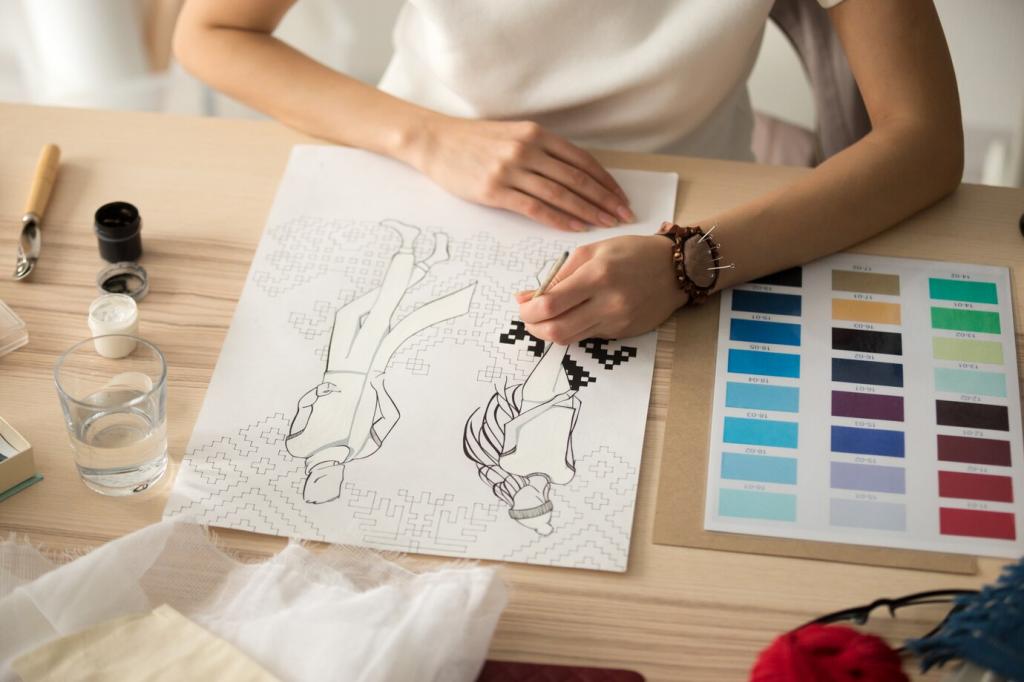

Meet the Color Wheel
Primary colors are your base players; every other color is recruited from them. Mix primaries to get secondaries, then mix again for tertiaries. Keep a small reference wheel in your sketchbook and note which pencil or marker brands match each hue best.
Meet the Color Wheel
Warm colors lean toward energy, sunlight, and closeness; cool colors lean toward calm, distance, and shade. When sketching a street scene, warming the foreground and cooling the background instantly adds depth. Share a warm–cool example from your sketchbook in the comments.
Meet the Color Wheel
Red–green, blue–orange, and yellow–purple are classic complementary pairs that spark vivid contrast. A beginner named Maya once revived a dull fruit sketch by lightly layering green into red shadows. That tiny complementary hint made the apples pop. Try it and tell us what changes.
Meet the Color Wheel
Lorem ipsum dolor sit amet, consectetur adipiscing elit. Ut elit tellus, luctus nec ullamcorper mattis, pulvinar dapibus leo.